Sharp design system

Role: Product designer (design system lead)
Company: Sharp Healthcare
Timeline: 2022-current
Tools: Figma, Notion

design system image

UX/UI Methodologies

• Component research
• UI design in Figma
• Style guide and pattern library‍
• Documentation in Notion
• Implementation and QA/UAT process
• Component updates/maintenance
As the lead designer for this project, my role consisted of finding the right tools to build and house our design system. We created our components starting with atomic design (the smallest building blocks including colors, typography, buttons, etc) and scaling to molecules and organisms. Throughout the design process, it was important to make sure all our components and design patterns were accessible and simple to navigate for our typical patient, as well as delightful to use.

The problem

Inconsistency across webpages including fragmented padding guidelines, color usage, and general look and feel.
Duplication of frequently used components with no real guidelines for usage or specs.
Inefficient workflow between designer and developer with many one-off decisions made rather than system-wide decisions.
Accessibility concerns including color contrast and font sizes that did not meet WCAG standards.

Goals and benefits

• Single source of truth for designers and developers, including components, patterns, and styles.
• Based on atomic design principles to increase consistency and efficiency.
• Follows best UI/UX practices
• Meets WCAG 2.0 AA accessibility requirements

Starting with the style guide

In close collaboration with our senior designer, we put thoughtful decisions into our branding and style refresh. A particular focus was prioritizing accessibility in areas including color, typography, and touch target sizes to name a few.

Our style guide consists of:
• Branding (e.g. color, typography, icon library, logos)
• Breakpoints and grids
• Border radius
• Image a photography guidelines
• Voice and tone

Creating the component library

Component audit

We reviewed existing symbols in Sketch that we wanted to bring over into Figma. I redesigned them and created reusable components.

Research and development

New components also needed to be added to our library. We researched existing patterns in the wild to inform expansion of our design system.

Documenting in Notion

Documentation

Every component and block was thoroughly documented in Notion, including purpose, behavior, states, breakpoints, and accessibility considerations.

Syncing visual specs

Every documented item in Notion has Figma links of visuals that are live and updates in real time.

Migrating to a new content management system (CMS)

At this point in time, our team and the development team had chosen to move forward with Contentful as our new CMS. We chose this new CMS as it gave us flexible options to control how our components and blocks are utilized as well as input our own fields, help text, and control displays.

Results and maintenance

• Our site is now live using our new design system components
• The time taken to design screens and build out pages on our CMS has cut down from hours to minutes at times.
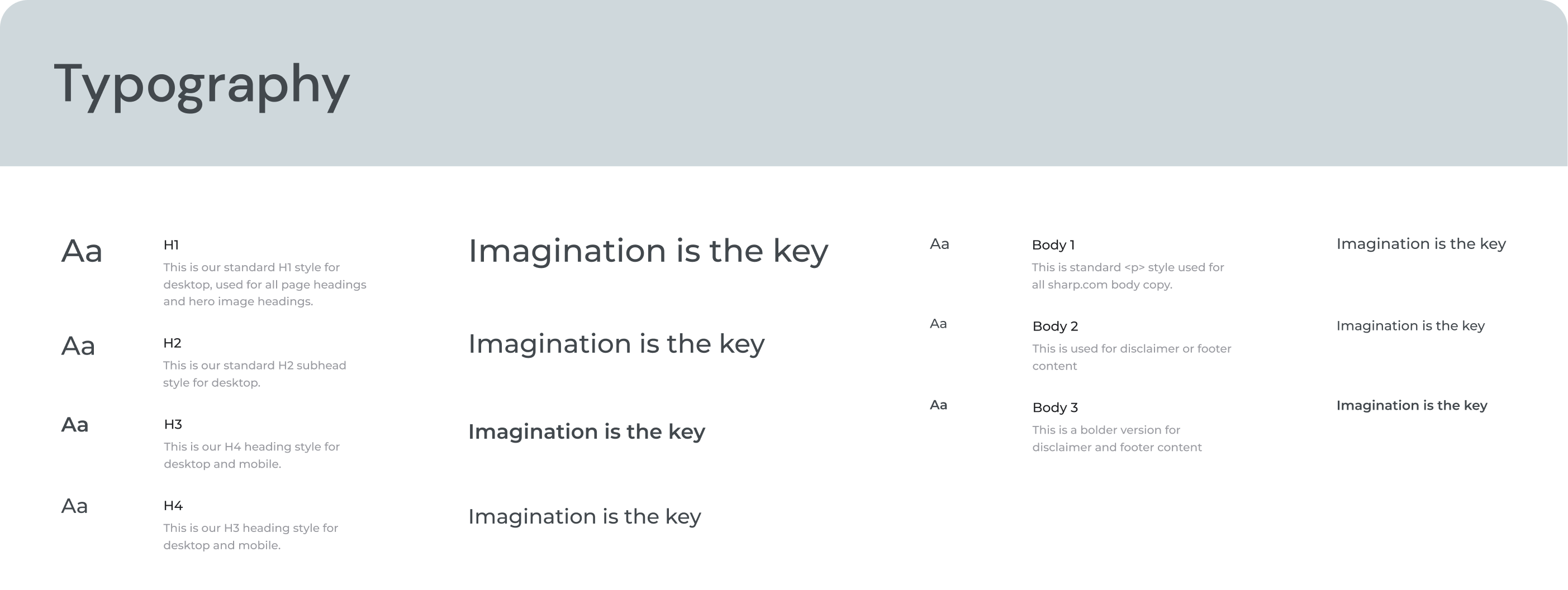
• We continue to make continuous enhancements and bring in new components as needed for Sharp's many products. It is a living document that continues to evolve and improve. This design system was the result of amazing hard work and collaboration between our amazing team of UX designers, architects, and a fully stacked development team.

View our design system

Next project:

SharpAI: A reliable large language model contained within Sharp's network for Sharp employees